
Magic Beanstalk ABC
An English Alphabet Learning App for 4-8 Years Old ESL Children
My Role
UI/UX Design
Design System
Client
Self-initiated Project
Time
April-June 2025
Deliverables
User Research, User flows, Wireframes,
Lo-fi & Hi-fi Mockups, Design System
Brief
Overview
A self-initiated app concept helping children aged 4–8 learn the English alphabet as a second language, designed as a complementary practice tool for home and classroom use, with progress tracking for supporting adults.
Challenge
Through classroom observation and informal assessments, I noticed many young ESL learners struggled with letter shape recognition (such as 'b' and 'd'), sound association, and basic phonics. Outside the classroom, support was limited as parents often had low English proficiency or little time to help, and most existing apps assumed native speaker knowledge, making them unsuitable for ESL beginners.
Solution
Informed by competitor research, teacher and parent surveys, and interviews with two young learners, I designed a gamified app using animations, illustrations, and minimal text for intuitive navigation. Level-based progression and rewards encourage consistent learning, while a progress tracking dashboard helps parents and teachers stay informed without needing English proficiency.

Research
Observation
While teaching, I observed that children often struggled with recognising letter shapes, sounds, and phonics. Engagement was another challenge, requiring interactive approaches such as game-based learning. Conversations with parents also revealed difficulties in maintaining consistent practice at home, largely due to a lack of motivation.
Background Research
Drawing on insights from Child-Computer Interaction (2nd Edition) by Juan Pablo Hourcade and a 2025 report by Common Sense Media, two key findings emerged. Children’s learning motivation is strengthened by appropriately challenging tasks combined with clear, immediate feedback. In addition, 66% of parents report relying on screens to occupy their children while attending to other tasks.
User Survey
A survey of 8 parents and 3 ESL teachers revealed 2 key challenges for young learners: low motivation, and difficulties with phonics and pronunciation.
Persona
The insights helped shape two key personas—Emma, a curious but easily frustrated learner, and her mother Anna, a busy parent trying to stay involved despite language limitations.

Anna Wu
Mother, 37 years old, Full time job, basic English proficiency
Goals
Wants Emma to start learning English at home to keep up with school and future opportunities.
Hopes Emma can gain confidence in speaking English without feeling pressured.
Wants Emma to develop an interest in English naturally instead of relying only on cram schools.
Prefers a convenient, structured way to integrate English at home despite her busy schedule.
Frustration
Lack of time to support Emma’s learning
We don’t speak English at home, it’s difficult to create an English environment
Limited English Proficiency
Emma isn’t interested in the English flash cards and books I introduced to her

Emma Tsai
Daughter, 6 years old, English learner, kindergarten
Goals
Wants to impress parents by her progress
Hopes to make English feel fun rather than lesson or homework
Frustration
Difficulty Understanding Spoken English
Fear of Making Mistakes (Low Speaking Confidence)
Lack of English Exposure at Home
Emma isn’t interested in the English flash cards and books that introduced to her
Struggled with pronunciation
Lack of learning motivation
User Story
Anna Wu
Mother, 37 years old, Full time job, basic English proficiency
As a mom of three kids, I want to track each child’s progress in grammar, pronunciation, and vocabulary through individual performance charts, so that I can identify their challenges and guide their learning effectively.
Emma Tsai
Daughter, 6 years old, English learner, kindergarten
As a game-loving child, I want English learning to feel like playing fun and interactive games, so that I stay engaged and improve without feeling forced to study.
User Journey

Parent adoption journey (Anna)
Anna's journey shows that trust is built gradually. She enters stressed and uncertain, and her anxiety resurfaces at the tracking and routine stages around progress visibility and screen time guilt. Parents need reassurance at multiple points, not just onboarding. This directly informed the progress dashboard and screen time notification feature.

Child learning journey (Emma)
Emma's journey shows that motivation drops when practice feels forced rather than chosen. She disengages when confused and only recovers confidence through visible praise. This shaped the gamification system, non-competitive game mechanics, and visual reward feedback throughout the app.
Design Challenges
From the user journey, I identified several design challenges and defined a focused scope based on the project constraints.
Engaging learning environment
Visual Guidance
Clear Progress
Build Motivation & Confidence
Playful & Interactive experience
Design Scope & Market Insights
Focused Scope
As a solo project with limited time, I narrowed the content to alphabet, basic phonics, and essential vocabulary.
App Review Insights
From Studycat and Lingokids, I adopted a separate parent/child interface, but replaced negative feedback with encouraging responses.
Motivation Strategy
Instead of relying only on basic gamification, I emphasised positive reinforcement and independent play.
Ideation Sketch
I sketched out different gameplay, reward, and parent experience ideas to explore how I could meet my design goals.

Game concept
How might we make learning the alphabet & vocabulary fun and memorable through playful, interactive methods?

Reward & Motivation System
I explored visual ways to motivate kids without pressure, such as surprise rewards, badges, and friendly feedback like claps or stars.

Parent Experience & Safety
I also considered how to create a safe, simple parent experience—minimizing information input and adding layers like password-gated dashboards.
Lo-fi Prototype & User Testing
Tested low-fidelity prototype with two parents. Their feedback helped refine progress tracking, simplify setup, and improve how rewards were introduced.
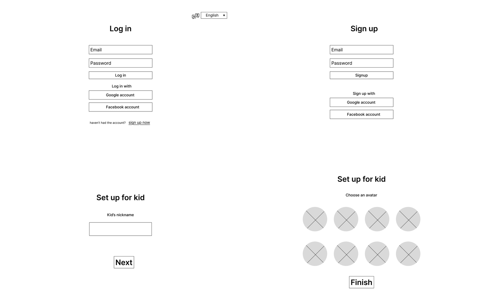
Onboarding User Flow
During onboarding tests, users were confused by the login/signup options. I prioritised Sign up for new users and added a way to explore the app without an account.

Homescreen
Users didn’t naturally start from “Aa” as intended. They were drawn to the stars and treasure box first. This showed the need for clearer instructions and stronger visual guidance. One tester also suggested adding more visual variety to sustain children’s interest.
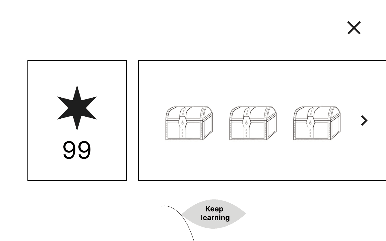
Reward system
Testers found the stars and treasure boxes unclear, making rewards feel meaningless. This led me to redesign how rewards are introduced to ensure a sense of progression and benefit.
Key Design Decisions

Guide kids through a structured, rewarding game flow
I created a clear game progression where each task builds on previous ones, and users receive visual feedback and rewards after each round.
The game design encourages gradual learning of letters and phonics through playful, pressure-free interaction.

Motivate children through a meaningful reward system
After testing, I refined the reward system to let kids exchange stars for visual items.
This gave rewards a clear purpose and encouraged positive reinforcement

Support parents from onboarding to progress tracking
Parents are guided through an onboarding flow that helps them set up the app for their child.
A parent dashboard allows them to view their child’s learning progress in specific areas, making it easier for parents to stay involved, even with limited English proficiency.
Hi-fi Design
Improved the app's guidance, better communicate reward value, and simplify the onboarding experience for real parents and children.

Onboarding Process

Game Flow

Reward System

Parent Dashboard
Device Strategy & Responsive Thinking
Adopting a tablet-first strategy, the larger screen makes interaction easier for young children while also enabling parents to participate alongside them. On mobile, children's screens maintain a landscape layout to preserve the wider view that suits young users, while parent-facing screens use portrait mode to match the way adults typically hold their phones.


Design System
Color Tokens
Primary
Primary Green was chosen for its association with growth and positivity. It also reflects the app’s theme—the beanstalk—making it a fitting choice for a playful and educational children’s app.

Secondary

Background
Background image supports the game’s visual theme, while background colours are used in the dashboard and cards for clarity and consistency.

Typography Tokens
Typeface

I chose a rounded sans-serif typeface to match the child-friendly and approachable interface style. Below is how heading levels are defined across the app:
— H1 is used for screen titles
— H2 is used for section headers in the parent dashboard
— H4–H6 are used for in-app instructional content

UI Components
Buttons
Buttons come in different sizes and states to accommodate various tasks—from navigation to confirmations.

Utility Buttons
Utility buttons are custom-styled components that combine icons, text, and values to deliver key functions such as navigation, profile access, and reward display. Each button is visually distinct to help young users and their parents quickly recognize their meaning without needing to read.

Inputs & States
Input components use color-coded borders and tooltips to indicate different states (default, active, completed, error), helping users understand progress or fix mistakes with minimal instruction.

Progress & Performance
The progress bar and performance icons help visualize learning milestones. Circular steps show current status, while star icon reinforces progress in a fun and motivating way.

Spacing Tokens
Spacing & Gaps
These spacing tokens standardize padding, margins, and layout gaps across screens—ensuring visual consistency and responsive structure.

Takeaways
This project was my first full UX case study and challenged me to design for young children who don’t yet understand English. I had to think carefully about how to keep them engaged through intuitive interactions, playful games, and a meaningful reward system. Along the way, I explored principles of child-computer interaction and learned how to structure smooth, age-appropriate user flows.
One key insight was that children interact with apps in diverse and unpredictable ways. As a designer, I learned the importance of anticipating multiple interaction scenarios to ensure a clear and frustration-free experience.
If given more time, I would improve the Parent Dashboard to include more specific reports, enabling parents to better understand what their child is learning. Overall, this project strengthened my foundation in UX design and helped me grow more confident in designing for both children and parents across different device contexts.